Pepe
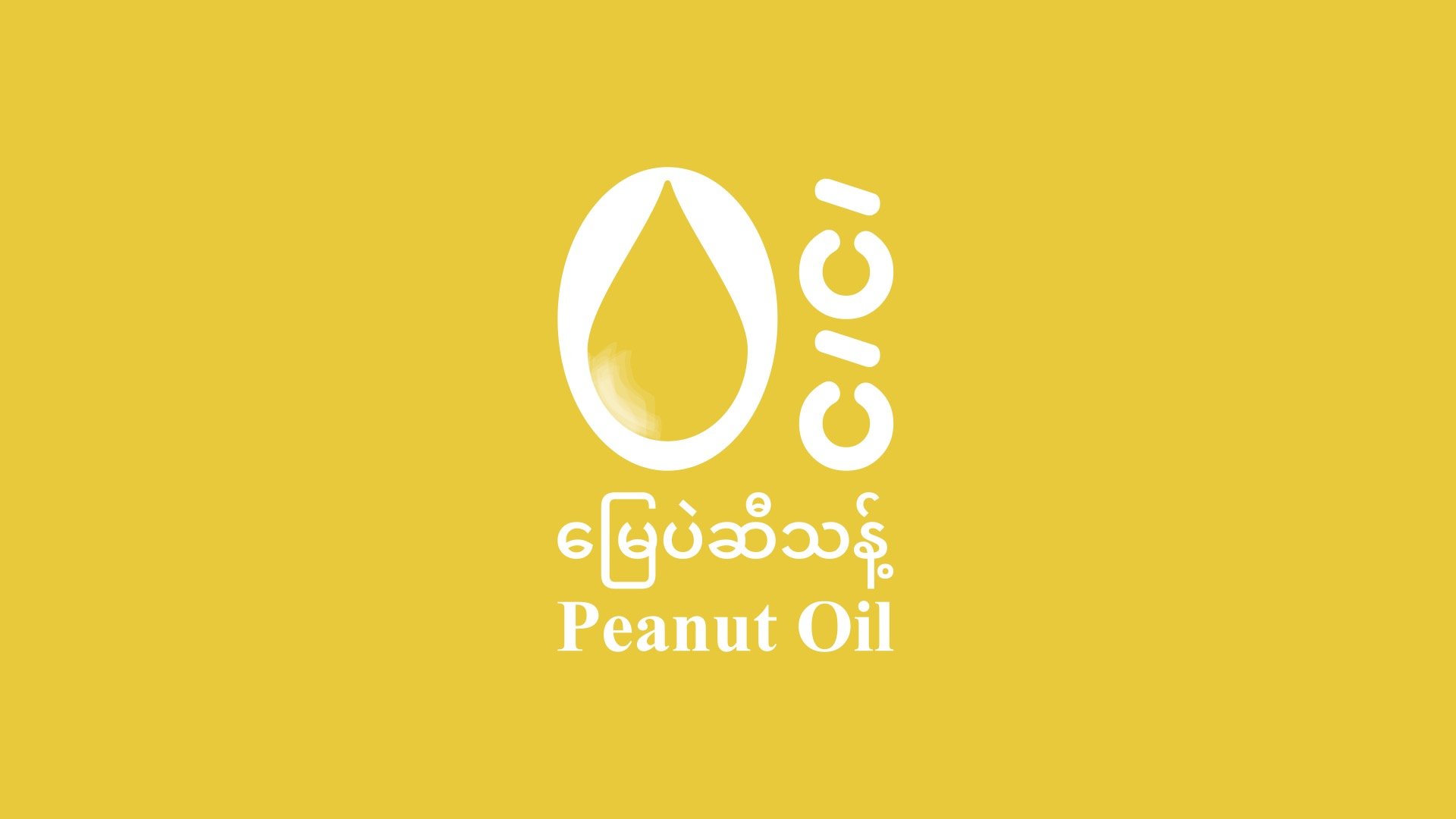
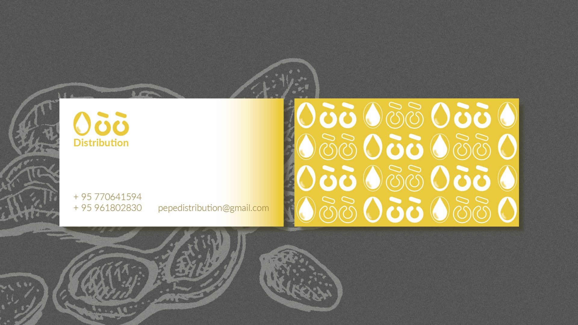
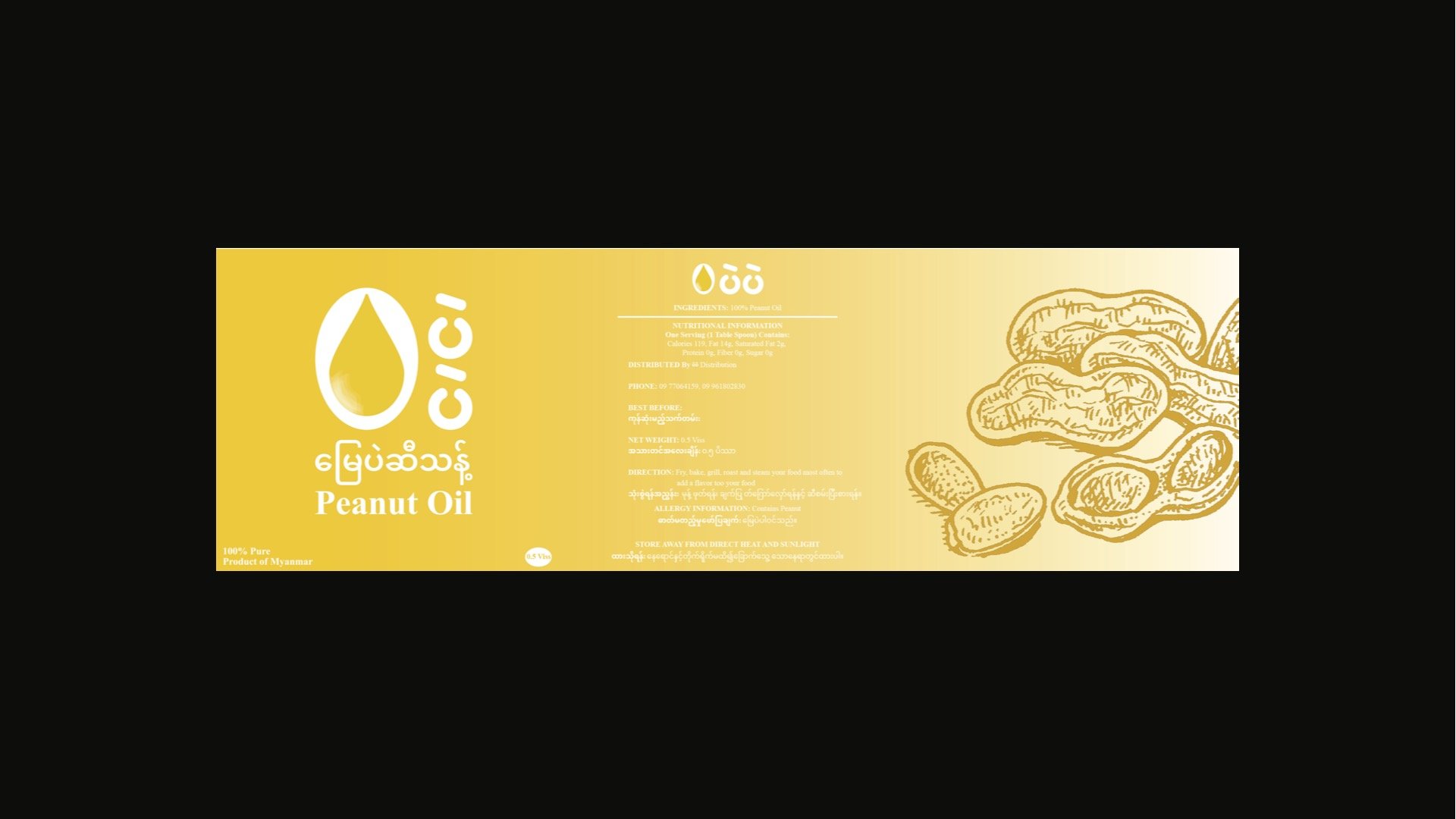
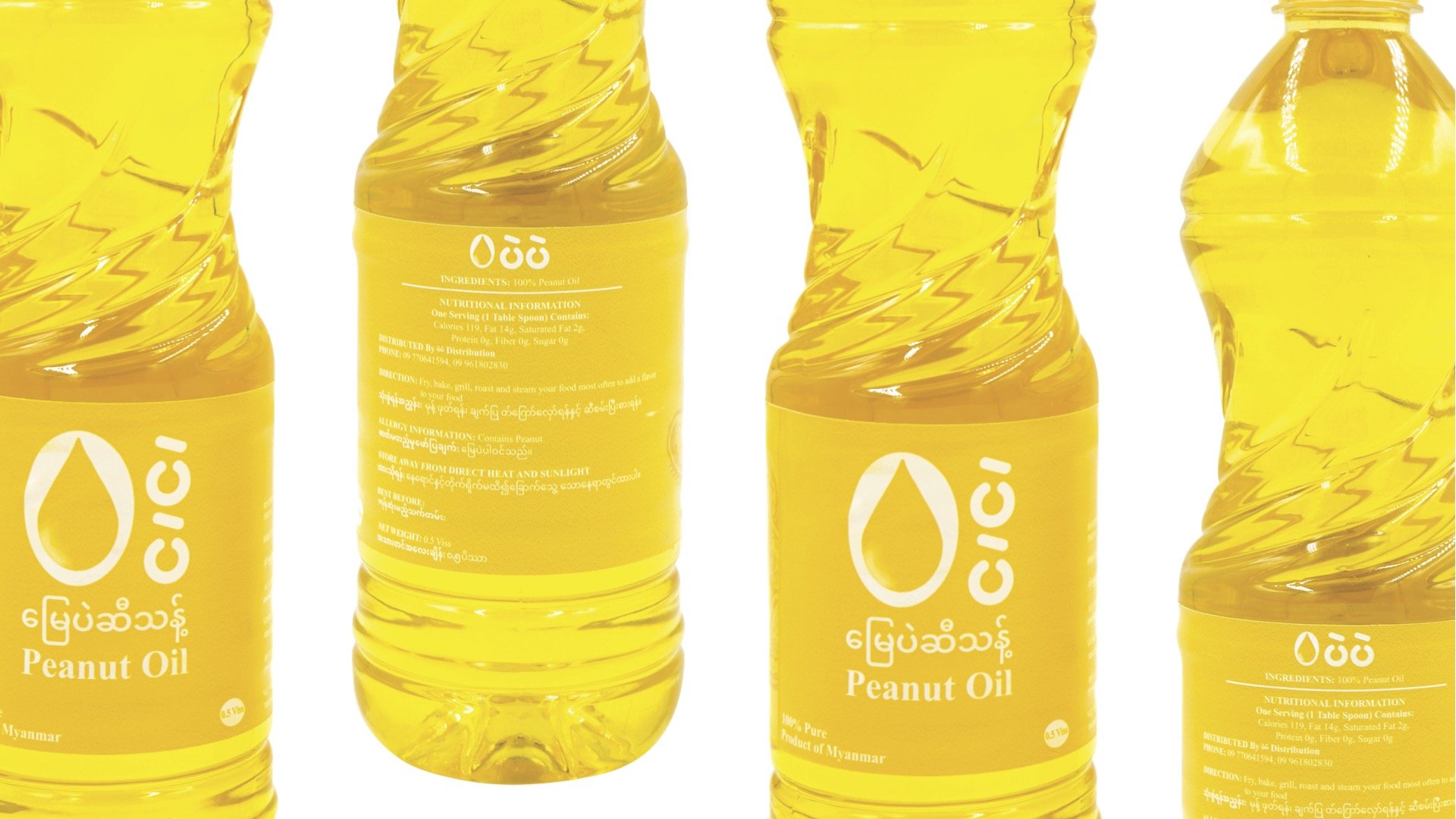
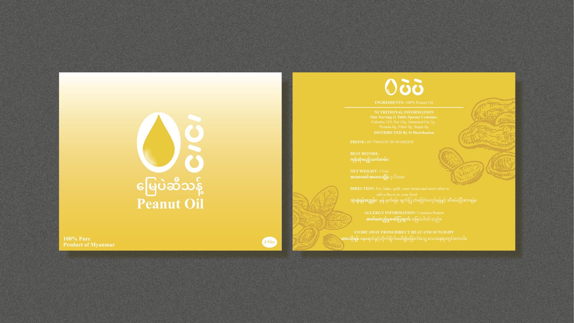
Designed the complete brand identity, including the logo, colors, shapes, fonts, and imagery. Our aim was to create a family-friendly peanut oil brand that's instantly recognized as a top-quality cooking oil. The golden yellow represents the quality of the oil that is pure as gold which is one of the main identifiers of the brand. The second most important element is the oil droplet that unmistakably indicates cooking oil with a little shimmer to highlight the brand’s transparency accompanied by rounded shapes and a friendly looking set of fonts to reflect it’s family oriented personality.
